Convert images to arrays
 Convert any image to data array
Oftentimes, you will have an image that you want to extract data from. It will most likely be something annoyingly minor, but will somehow turn into the most important piece to the puzzle that you NEED RIGHT NOW! Okay… maybe that’s just me. Sometimes it’s nice to be able to extract data from an image you found in a journal article to replicate the results.
Here, I will go through the steps I took to convert an image into RGB format (using Python - naturally) and convert it into an array of data. From there it gets interesting. A lot of images I come across have been interpolated from relatively sparse data. You don’t need all that data! It’s a waste of space and you’re better off trimming the bits you don’t actually need - especially if you would like to do some spatial post-processing.
Here are the main steps:
- Import the image using the
scipy.ndimagemodule. - Setup a colour map using
matplotlib.colors - Query the colour map with many numbers along the interval you’ve defined and store that in a KDTree.
- Query the KDTree using the $m \times n \times 3$
ndimageRGB array. The result is an $m \times n$ data array. - Reduce the data by taking the first spatial derivative using
numpy.diffand removing points where $|\nabla| > 0$. - Use
sklearn.DBScanfrom the scikit-learn module to cluster the data and remove even more unnecessary data. - Have a beer.
At the end I have a Python class that contains all these steps rolled into one nifty code chunk for you to use on your own projects, if you find this useful.
Ready? Here we go…
Load the image
from scipy import ndimage
import numpy as np
import matplotlib.pyplot as plt

im = ndimage.read("filename.jpg") # flatten=True for b&w
plt.imshow(im)
plt.show()
That looks nice, im is a $m \times n \times 3$ array - i.e. 3 sets of $m$ rows, $n$ columns, that correspond to the number of pixels, for each RGB channel.
Now let’s create the colour map and chuck everything into a KDTree for nearest-neighbour lookup.
Seriously, KDTrees are awesome. srsly.
from scipy.spatial import cKDTree
from matplotlib import colors as mcolors

def scalarmap(cmap, vmin, vmax):
    """ Create a matplotlib scalarmap object from colour stretch """
    cNorm = mcolors.Normalize(vmin=vmin, vmax=vmax)
    return plt.cm.ScalarMappable(norm=cNorm, cmap=cmap)

scalarMap = scalarmap(plt.get_cmap("jet_r"), 0.0, 0.7)
value_array = np.linspace(0,0.7,10000)
color_array = np.asarray(scalarMap.to_rgba(value_array))
color_array *= 255 # rescale

tree = cKDTree(color_array[:,:-1]) # Last column is alpha
d, index = tree.query(im)
data = value_array[index]
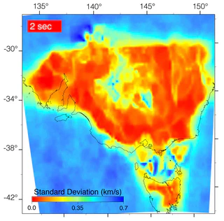
We scaled the colour map between 0.0 and 0.7, which corresponds to the extent in the image.
Optionally, we could mask pixels that are some distance, $d$, from the colour map.
E.g. data = np.ma.array(value_array[index], mask=(d > 70)).
This would mask out the black text and white background in the image.
I don’t know a better way to map the RGB colour arrays to data than to query entries in a KDTree. If you do, please mention in the comments below.
Data reduction
Now that we have converted an image into an array we can reduce the data so that only the important bits remain. Firstly, we take the first spatial derivative and find where $\nabla = 0$.
dx = np.abs(np.diff(data[:,:-1], axis=0))
dy = np.abs(np.diff(data[:-1,:], axis=1))
dxdy = (dx + dy)/2.0

mask = dxy < 1e-12
Here, mask is a $m \times n$ boolean array that contains True values where we have good data.
But we can reduce it even further using DBScan.
This finds spatial regions of high density and expands clusters from them.
I think this is basically a higher order use of KDTrees, but let’s humour sklearn toolkit anyway.
from scikit.cluster import DBSCAN

Xcoords = np.arange(data.shape[1]-1)
Ycoords = np.arange(data.shape[0]-1)
xx, yy = np.meshgrid(Xcoords, Ycoords)

db = DBSCAN(eps=0.05, min_samples=1).fit(xx[mask], yy[mask])
labels = db.labels_
num_clusters = len(set(db.labels)) - (1 if -1 in db.labels else 0)

def get_centroid(points):
    """ find centroid of a cluster in xy space """
    n = points.shape[0]
    sum_lon = np.sum(points[:, 0])
    sum_lat = np.sum(points[:, 1])
    return (sum_lon/n, sum_lat/n)

tree = cKDTree(np.vstack([xx[mask], yy[mask]]).T)
x = np.zeros(num_clusters, dtype=int)
y = np.zeros(num_clusters, dtype=int)

for i in xrange(num_clusters):
    xc = xtrim[mask][labels == i]
    yc = ytrim[mask][labels == i]

    centroid = get_centroid(np.vstack([xc,yc]).T)

    d, index = tree.query(centroid)
    x[i], y[i] = tree.data[index]

mask2 = np.zeros_like(xx, dtype=bool)
mask2[y,x] = True
Above, we found the centroids for each cluster to reduce the substantially reduce the dataset from 16667 points down to 1221. Each colour represents a unique cluster in the image below.
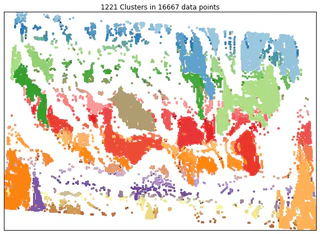
mask2 has significantly improved on mask by finding clusters in the data.
Now that it’s done, let’s see if we can reconstruct the image we first started with.
This is a good check to make sure we haven’t removed too much of the original data.
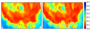
Overall the two look pretty similar!
There are some bits that could be refined by adjusting some of the parameters, e.g. eps in DBScan and $\nabla \approx 0$.
Also, adjusting the distance threshold in the original RGB $\rightarrow$ data conversion would remove artifacts caused by the coastline (i.e. bits that don’t find on the colour map).

I am an ARC Industry Research Fellow in the School of Geography, Earth and Atmospheric Sciences at The University of Melbourne. I am an expert in fusing Earth evolution models with data to understand how groundwater moves critical minerals through the landscape. Related research interests include the cycling of volatiles within the Earth, probabilistic thermal models of the lithosphere to unravel past tectonic and climatic events, and understanding the how enigmatic volcanoes form.
I am a vocal advocate for the integral role of geoscience in responding to challenges we face in transitioning to the carbon-neutral economy. As an expert in my field, I have been interviewed in national and international print media, TV, and radio on a wide variety of subjects including earthquakes, volcanoes, groundwater, and critical minerals.